John Lewis
Stuck Between a Phone and a Desktop
Finding your identity as an iPad app is difficult. For John Lewis, this meant being somewhere between your popular iPhone app, and your trusty, fully-featured desktop site. We set out to understand how our customers were using the iPad app and to give it a purpose.
Goal
To increase sales, more positive app reviews and encourage more browsing during the evening.
Role
Lead the product design, writing user stories, user testing facilitator and note taker, wireframing features, interaction design.
Duration
6 months
Introduction
Before beginning, we had some foresight from our experience working on the app about where to focus on. One of the biggest challenges user’s were having was difficulty navigating between departments. They wanted more from their experience. Also, the standard they were expecting was being pushed higher by other, smaller, independent apps. I worked with the business to understand the cause of these challenges, and offered advice for prioritising these issues. After understanding what the business wanted to achieve and what it’s customers wanted. As a team, we identified the key areas we wanted to investigate. Work began within an agile team of 8-10 people to deliver changes over 6 months.
Sketching Workshops
During the project I organised a series of workshops were, where-by different activities were used to explore and tackle key topics. One of which consisted of the whole team sketching ideas and presenting them. The activity pictured on the left works by where each person draws six ideas on a piece of paper in a space of five minutes. This process is then repeated for another five minutes to generate more ideas. Each person is then given ten minutes to develop and annotate their best ideas on another piece of paper, so the rest of the team can comment on them.
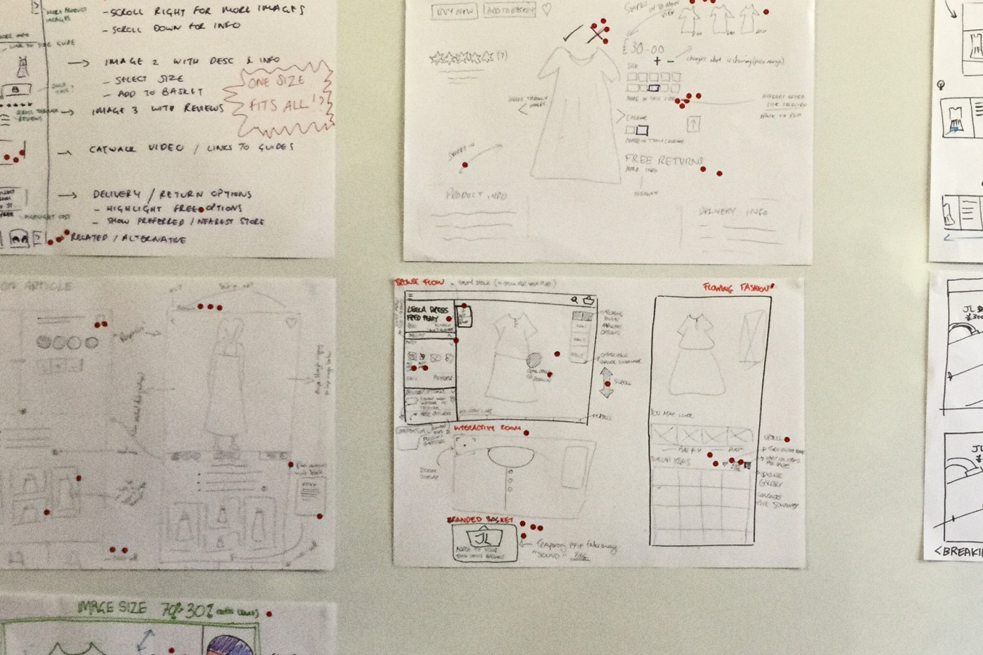
The sketches are then stuck on a wall so each person can “dot” vote their favourite idea. Ideas to prototype were then determined by the product owner's final dot. The ideas with the most dots, formed the basis of the prototyping in the next workshop.
Rapid Prototyping and User Testing
Before creating prototypes we started by writing down assumptions we wanted to test. These were statements about our user’s behaviour that we believed to be true, which then formed a base for us to storyboard key stages of the user’s journey. We looked at each step of the journey as a team and looked into discussed things such as usability issues, development limitations, design considerations and matched these against the business’ goals. While this was a very intensive process, important concerns were identified and ultimately it reduced the time we needed to for developing the prototypes.
Understanding The Navigation
Comparing the John Lewis iPad app alongside the John Lewis iPhone app revealed that they were using different product navigation systems. To understand why this was the case I spoke with the product owner to understand how the app evolved into what it is today. One system offers pictures for navigation, but with a side effect of treating headings as links; doubling the number of clicks to products. The pictures were giving the app it's "playful look" but severely damaging the app's usability.

Laying a new foundation
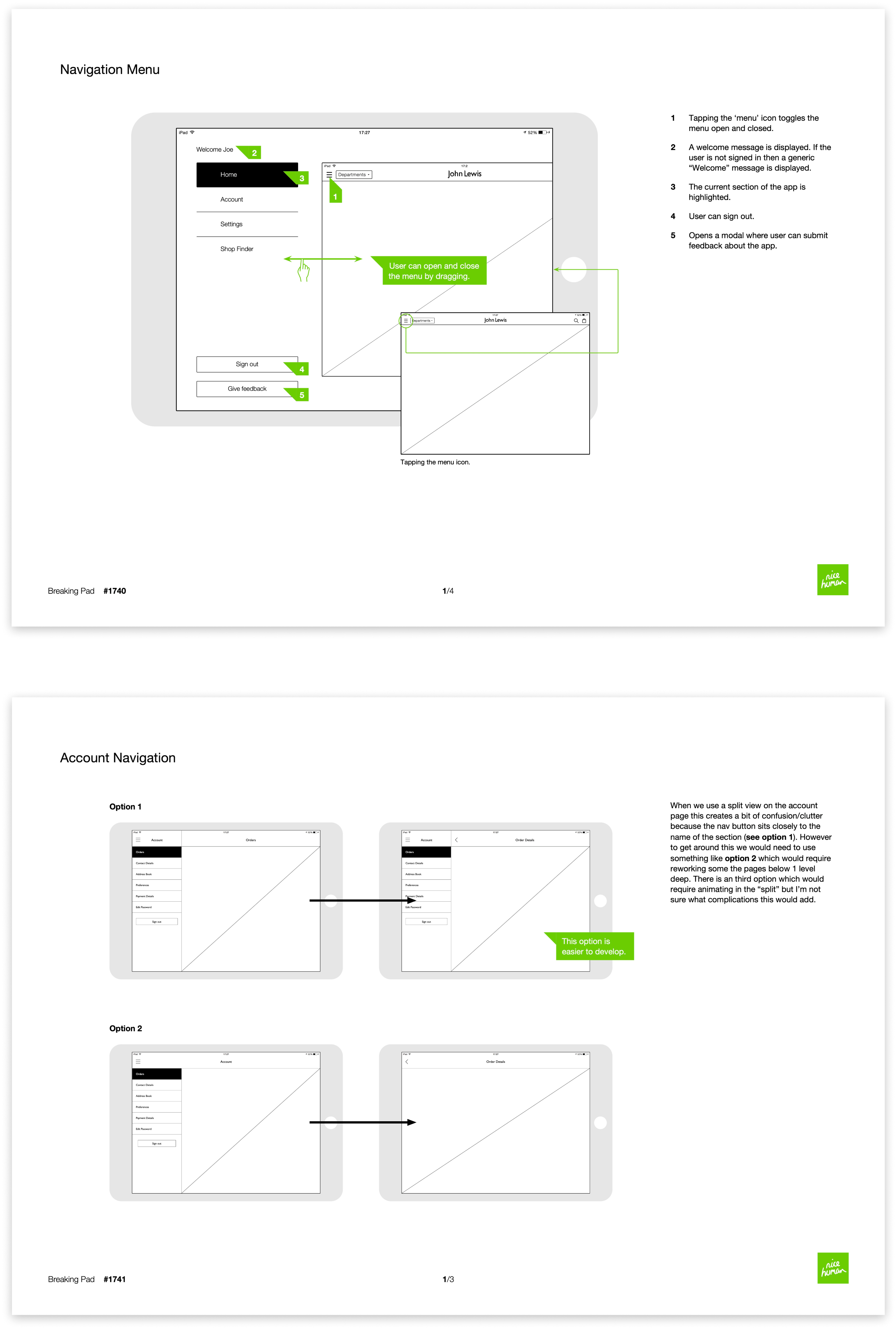
Using the inspiration from the navigation on the iPhone version of the app I was able to propose a new simplified version of the navigation for the iPad version. In this particular project I used wireframes to communicate designs to developers. However, creating these alone is not enough and required constant communication between myself, developers and everyone else on the team.
Outcome
The app saw significant increases in both downloads and sales. The work we did, gained trust and acknowledgement with the rest of the business, therefore inspiring changes to other John Lewis products. The iPad app gained a 4.5 rating (previously 3) on the App store. It won several awards for best iPad app in retail 2016.